

November 28, 2023 •Array Team

Gather and combine multiple engagement metrics that provide context for more actionable insights.
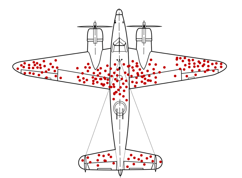
There’s a somewhat famous diagram of a World War II plane with red dots depicting where bullet holes were in the planes that returned to the airfield (see figure 1). The diagram of densely packed bullet holes in the wings, fuselage and tail of the plane is often used to illustrate certain biases in thought. When asked which areas of the plane should be reinforced with steel plating, most people draw the conclusion that it should be the dense, red areas. After all, they were riddled with bullets. However, when considering this contextually, these bullet patterns were in planes that made it home. The areas where there are no red marks represent potentially fatal hits—these planes didn’t make it back. These, then, are the areas in need of reinforcement. In terms of life sciences meetings, data such as who was in the room, how engaged they were and what they liked or didn’t are the bright red dots. Seeing them at face value can cause you to miss the context of demographics around results, root causes and possible next steps. To see the full picture, you need to consider in the planning stages what data will most accurately provide insights into the meeting’s goals and whether they were met.
Fig. 1: Illustration of hypothetical damage pattern on a WW2 bomber. Based on a not-illustrated report by Abraham Wald (1943), picture concept by Cameron Moll (2005, claimed on Twitter and credited by Mother Jones), new version by McGeddon based on a Lockheed PV-1 Ventura drawing (2016), vector file by Martin Grandjean (2021)
Early in the planning stage, you determine your meeting’s goals and then begin the process of choosing the venue, vendors, speakers, content and logistics that you believe will best help meet those. Data collection also must be tied to those goals because every time you use technology to engage an attendee, you convert them to a participant and collect a data point or event engagement metric that can be used to assess if your goals were achieved. But engagement metrics, or vanity metrics as they are often called, rarely tell the full story.
Any engagement metrics or data viewed without the context of why it’s important as it relates to goals such as study recruitment, deficiency in speaker training, or other overall meeting goals is going to come up short. For instance, rather than simply saying that you want to engage your audience, ask yourself what that engagement means. Engaging attendees is somewhat a given at any event, and we all strive to maximize it, but only once you determine the rationale for why, can you engineer ways to truly benefit from it.
The following are examples of how looking at data in a larger context can change what it’s telling you.
Results show there were a lot of questions asked during this meeting, so you had a high level of engagement. So What? Well, if you also have low correct answer rates on polling, it could suggest the questions were the result of a level of confusion and not an energized audience.
Similarly, your raw data might say your meeting had a high level of correct answers to polling questions. Is that the full picture? In context, by splitting this data by the experience level of attendees, you may discover the less experienced attendees did not get as many questions correct, or better yet, that the more experienced HCPs got more questions wrong, pointing to a more substantial challenge that you can now get ahead of.
Perhaps your data says there was lower engagement than you anticipated at this meeting. Should you be concerned? Contextually, if you correlate that there was also higher than average dissatisfaction with the registration experience for those with the lowest engagement metrics, you could exclude them from the overall engagement scoring and focus on fixing that single issue for next time.
One of your polling questions tied to a key goal of study recruitment was answered correctly by 75% of the respondents. Did you meet your goal? Well, when you look more deeply at which groups answered incorrectly, you find that the majority who got it right are from regional sites who are already hitting their recruitment targets (a key goal for investigator meetings). Going a step further and laying in role demographics, you could identify that it was mainly Principal Investigators, so your efforts when following up are going to be better spent on reaching out to site staff who got that question wrong, to help boost recruitment.
If you look at evaluation scores for hotel logistics and find an overall rating of 8.4 on a 10 scale, you might be happy with the results. However, if you layer in the benchmark hotel logistics score over the last 70 meetings and see that benchmark was a 9.5, you’ll realize satisfaction is lower for this meeting and can try to find out why. There may be some changes you want to make to the hotel or logistics in the future.
One strategy we employ with our partners is to ask what insight they want the data to provide and then develop a plan around that. If they say they want to be able to test their assumptions that experienced site teams are more likely to understand the study parameters, we might say, “Let’s collect some engagement metrics around the experience of site teams and ask questions indicative of understanding of patient eligibility.” Once we look at those responses together, we can come up with a clear picture of experience versus knowledge on that particular topic. We’re always looking for the other mechanisms that help tell a story beyond just that top level of data, the dense red dots.
Another way we delve deeper is to add confidence-based polling in our gamification. When we ask questions in a normal poll, correct answers are reported and we do analytics such as that mentioned above that takes demographics into account. Taking it one step further and asking how confident respondents were with their answers, we can identify whether people were good guessers or have an actual mastery of the subject. If we look at polling results and see that 95% got it right, that initially seems good. If we look at the confidence level to see that only 45% were confident in their answer, we have identified individuals who do not really fully understand this topic. Conversely, if there are participants who get answers wrong but are very confident, the stakeholder can now plan next steps to learn the source of the misinformation and correct it before it has a negative impact on a clinical trial, marketing or patient health. With the majority of meetings having the overarching goal of transferring knowledge to fulfill an organizational need, comparing multiple data points to get this type of actionable insight is a game changer.
When working with technology partners, don’t just settle for technology that collects meaningless data for you. Early in the process, identify what you really need to know and lean on your partners to strategically collect the combination of engagement metrics that will provide the right context for true insight. Then, design for how to get those engagement metrics through engineered engagement, leveraging the appropriate feedback tactics. It’ll be the difference between results that provide a lot of information but no insight, and results that tell you how to make sure your planes make it home.